How to Read a Basic Stock Market Chart
Learn how to interpret a basic stock market chart, including price axes, time frames, candlestick patterns, volume bars, and trend lines, so you can make more informed investment decisions.
Materials
- A device with internet access
- A free account on a charting platform (optional but recommended)
- Notebook or app for taking notes
Before you start
- Basic understanding of what stocks are
- Access to a free charting platform (e.g., Yahoo Finance, Google Finance, or TradingView)
Step 1 of 7

Identify the Chart's Axes
Every stock chart has two axes that form its foundation: • **X-axis (horizontal):** Represents time. It moves from left (older data) to right (more recent data). The time scale can range from minutes to decades depending on the selected time frame. • **Y-axis (vertical):** Represents the stock's price. Prices increase as you move upward and decrease as you move downward. Before reading anything else on the chart, orient yourself by checking what time period the X-axis covers and what price range the Y-axis displays. This tells you the 'window' of data you're looking at.
Most platforms let you zoom in or out on the X-axis. Start with a 6-month or 1-year view to get a good sense of the stock's overall trend before zooming into shorter periods.
Common mistakes
- ×Ignoring the Y-axis scale — a chart can look dramatic if the price range is very narrow, even if actual price movement is small.
- ×Not checking the time frame before drawing conclusions about trend direction.
Step 2 of 7

Choose and Understand the Chart Type
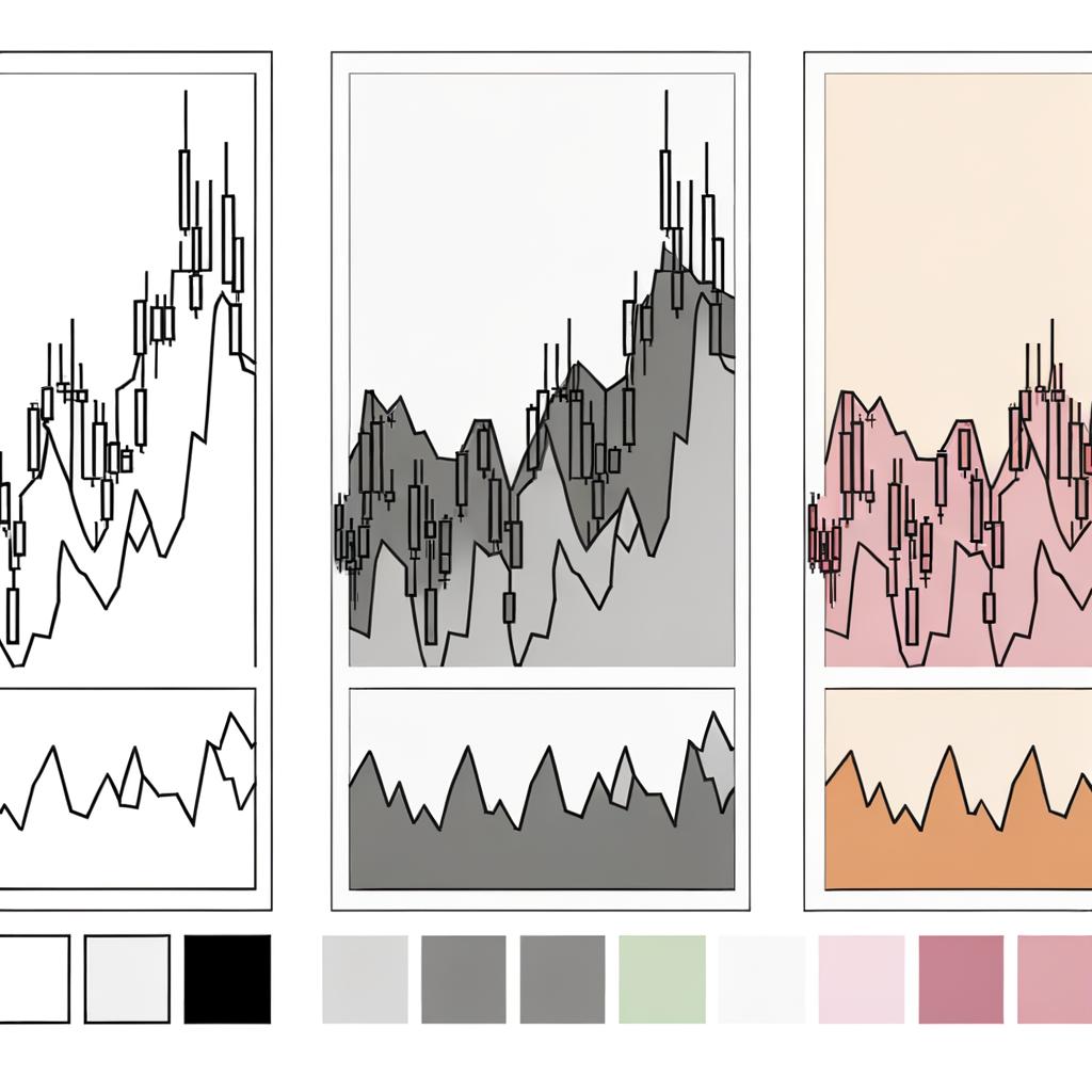
Stock charts come in several formats. The three most common are: • **Line Chart:** Plots only the closing price for each period, connected by a line. It's the simplest view and great for seeing the overall trend. • **Bar Chart (OHLC):** Each vertical bar shows four prices for a period — Open, High, Low, and Close. A small left tick marks the open; a small right tick marks the close. • **Candlestick Chart:** The most popular type. Each 'candle' shows the same OHLC data as a bar chart but in a more visual way. A wide body shows the open-to-close range; thin 'wicks' (shadows) show the high and low. A green (or white) candle means the price closed higher than it opened (bullish). A red (or black) candle means it closed lower (bearish). For beginners, start with a line chart to grasp the trend, then switch to candlesticks for more detail.
Candlestick charts are the industry standard. Learning to read them early will serve you well as you progress to more advanced analysis.
Common mistakes
- ×Confusing a red candle with a 'bad' stock — it simply means the price fell during that specific period, not that the company is failing.
- ×Assuming a long wick always signals a reversal — context and volume matter too.
Step 3 of 7
Select a Time Frame
The time frame determines what each candle or data point on the chart represents: • **Intraday (1m, 5m, 15m, 1h):** Each candle = minutes or hours. Used by day traders. • **Daily (1D):** Each candle = one trading day. Most common for swing traders and general investors. • **Weekly (1W) / Monthly (1M):** Each candle = one week or month. Preferred by long-term investors. The same stock can look very different depending on the time frame. A stock might appear to be falling on a daily chart but rising strongly on a monthly chart. As a beginner, the **daily chart** is the best starting point — it balances detail with clarity.
Always check at least two time frames — a longer one for overall trend context and a shorter one for detail. This is called 'multi-timeframe analysis.'
Common mistakes
- ×Making long-term investment decisions based on a short intraday chart.
- ×Switching time frames too frequently and getting confused by conflicting signals.
Step 4 of 7
Read the Price Action and Identify the Trend
Price action is the movement of a stock's price over time. The most important thing to identify is the **trend**: • **Uptrend (Bullish):** The chart shows a series of higher highs and higher lows — the price is generally climbing. • **Downtrend (Bearish):** The chart shows lower highs and lower lows — the price is generally falling. • **Sideways / Consolidation:** The price moves within a relatively flat range, with no clear direction. To spot a trend, draw an imaginary line connecting the recent peaks (resistance) or the recent troughs (support). If the peaks are getting higher over time, it's an uptrend. If the troughs are getting lower, it's a downtrend. Understanding the trend gives you the most important context for any other signal on the chart.
The phrase 'the trend is your friend' is a classic trading maxim — it's generally safer to trade in the direction of the prevailing trend rather than against it.
- If If the chart shows consistently higher highs and higher lows, do Identify this as an uptrend — look for buying opportunities on pullbacks..
- If If the chart shows consistently lower highs and lower lows, do Identify this as a downtrend — exercise caution and avoid buying until a reversal is confirmed..
- If If the price is moving sideways with no clear direction, do Identify this as consolidation — wait for a breakout above resistance or below support before acting..
Common mistakes
- ×Calling a trend after only 2–3 data points — a trend needs multiple consistent highs/lows to be reliable.
- ×Ignoring the broader trend and focusing only on recent short-term moves.
Step 5 of 7

Understand Support and Resistance Levels
Support and resistance are key price levels where the stock has historically struggled to move past: • **Support:** A price level where the stock tends to stop falling and bounce back up. Think of it as a 'floor.' Buyers tend to step in at this level. • **Resistance:** A price level where the stock tends to stop rising and pull back. Think of it as a 'ceiling.' Sellers tend to step in at this level. To find these levels, look for price areas where the chart has repeatedly reversed direction. The more times a level has been tested, the more significant it is. **Breakouts:** When a price moves decisively above resistance, that level can become new support (and vice versa). This is called a breakout and often signals a significant move.
Round numbers (e.g., $50, $100, $200) often act as psychological support or resistance levels because many traders place orders around them.
Common mistakes
- ×Drawing support/resistance lines through only one price point — they should connect at least two or three touches.
- ×Treating support/resistance as exact prices rather than zones — prices often slightly overshoot before reversing.
Step 6 of 7
Interpret the Volume Bars
Volume is the number of shares traded during a given period and is usually displayed as a bar chart along the bottom of the stock chart. It's one of the most important confirmation tools available. **Key rules of thumb:** • **High volume + rising price:** Strong buying interest — confirms the uptrend. • **High volume + falling price:** Strong selling pressure — confirms the downtrend. • **Low volume + price move:** The move may not be reliable or sustainable. • **Volume spike:** A sudden large increase in volume often signals a significant event (earnings, news, breakout). Always use volume to confirm what the price is doing. A price breakout on low volume is much less trustworthy than one on high volume.
Compare today's volume to the stock's average daily volume (often shown on the platform). Volume that is 2x or more the average is considered significantly elevated.
Common mistakes
- ×Ignoring volume entirely and relying only on price — this leads to false signals.
- ×Assuming high volume always means the price will continue in the same direction — volume shows conviction, not guaranteed direction.
Step 7 of 7

Add a Simple Moving Average (Optional but Useful)
A **Moving Average (MA)** is a line overlaid on the chart that smooths out price data to make the trend easier to see. It calculates the average closing price over a set number of periods. **Common moving averages for beginners:** • **50-day MA:** Shows the medium-term trend. • **200-day MA:** Shows the long-term trend. **How to use them:** • When the price is **above** the moving average, the stock is generally in an uptrend. • When the price is **below** the moving average, the stock is generally in a downtrend. • When the 50-day MA crosses **above** the 200-day MA, it's called a 'Golden Cross' — a bullish signal. • When the 50-day MA crosses **below** the 200-day MA, it's called a 'Death Cross' — a bearish signal. Most charting platforms let you add moving averages with one click.
Don't overload your chart with too many indicators at once. Start with just one moving average (the 50-day) and get comfortable with it before adding more.
- If If the stock price is consistently above the 50-day MA, do The stock is in a short-to-medium term uptrend — this is generally a positive sign..
- If If the stock price drops below the 200-day MA, do The long-term trend may be weakening — consider reassessing your position or waiting for a recovery above the line..
Common mistakes
- ×Using moving averages as precise buy/sell signals rather than as trend-context tools.
- ×Adding too many indicators, making the chart cluttered and confusing — known as 'analysis paralysis.'
Sources
Generated from model knowledge — verify any factual claims independently.